Sunset at 3am

The countless carefree summer evenings, always comfortably residing in the back of our mind.

(nikkithy, instagram)
The artist places focus on the seaside sunset and dark ocean clouds, steering away from pure photography and stepping into the realm of art. The geometric alteration and vintage color scheme transcend a representation of this moment to communicate an emotion.

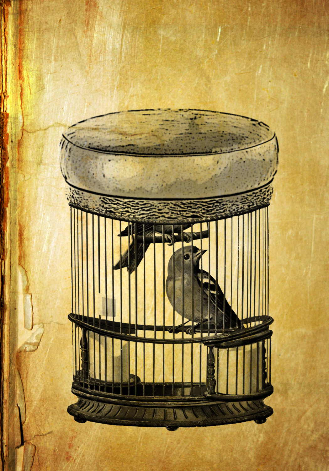
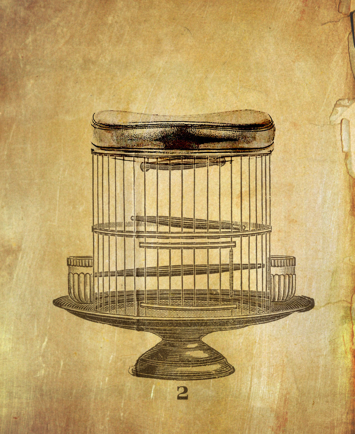
Here I tried the same technique.

By the way, check out Nikkity’s web store and blog here.

The Learning Process and a T-Shirt

You know, this image isn’t about growing. It isn’t about changing. Nothing too deep.
This is just my attempt to make something better.
The process of refinement.
The voyage toward new possibilities.
Starting with the realization that you always have room to grow, to change, and to think deeper.

Resurrected Ideas (But maybe just for these 5 minutes)

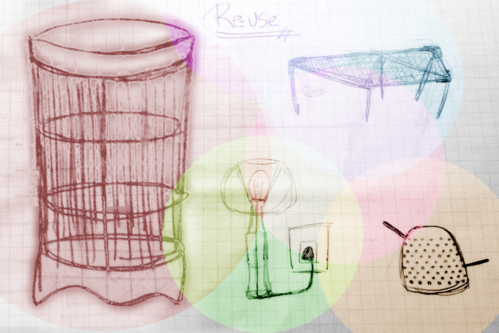
I felt a mixture of nostalgia and embarrassment as I went through my middle school sketchbook yesterday.  But in some ways these forgotten ideas and simple sketches have the power of suggestion for the future.


It is powerful to review the old and make revisions.

But it’s also powerful to realize, maybe some things in the past should be left there.

History and Theory: Design Past

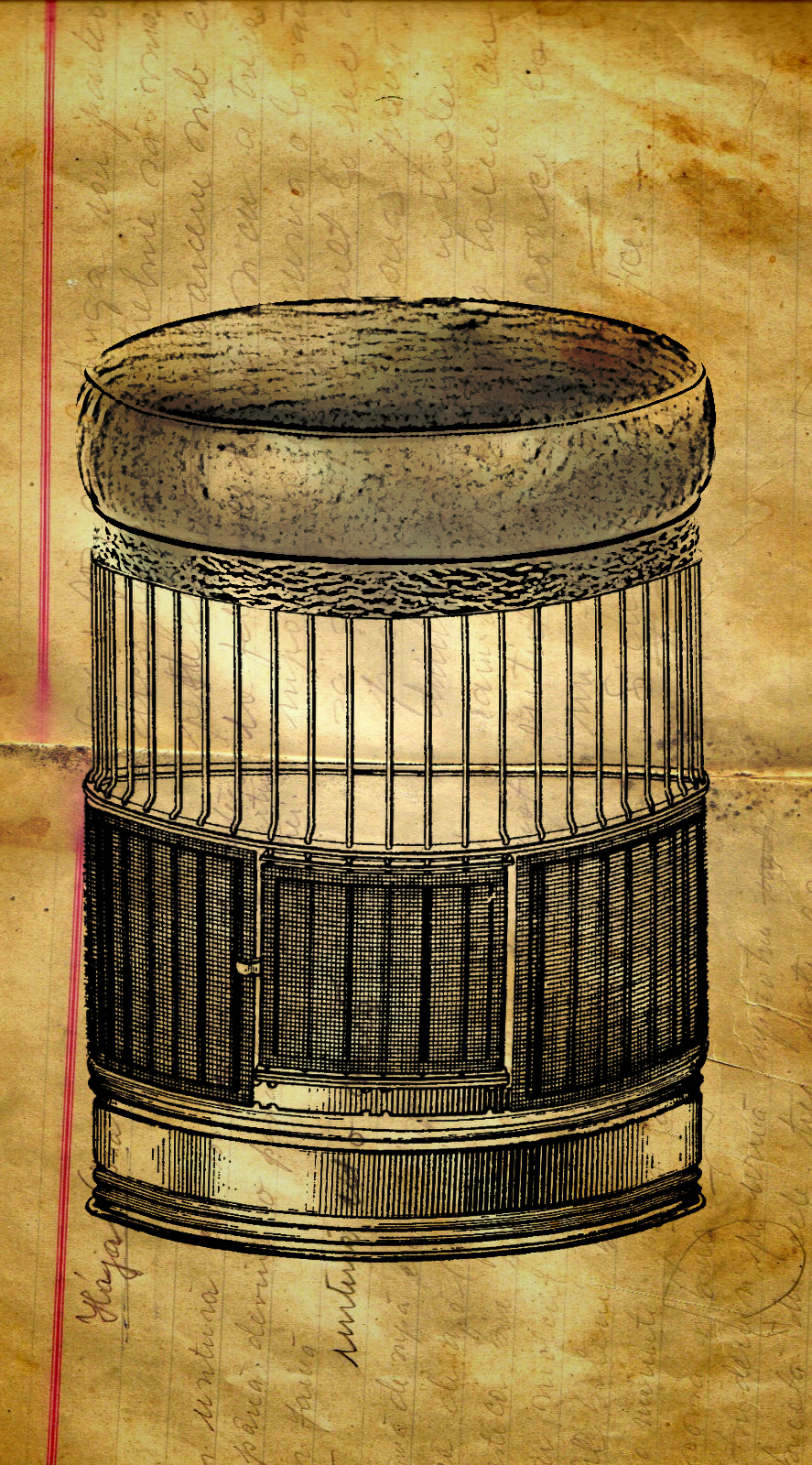
Starting this new semester, we are going into a lot of History and Theory which is included in the shaping of what architecture is as a whole. Our studies have taken us from the debate of art categories-the fine arts as compared to industrial arts; all the way to the push for a violent revolt of the arts and society as a whole. In the first few lectures, we focused on what it meant to be “Modern”, and what that means for architecture.

With the start of the industrial revolution, the world moved into the modern era–but some would say this isn’t the start of the modern era. The real change that occurred what the explosion of new materials and machines that allowed for so many new and different artistic expressions and styles.

The Arts and Crafts Movement was one of the first reactions to the Modern era and its effects. The Arts and Crafts Movement hoped to return to the more handcrafted tradition of creating all utilitarian and decorative items uniquely and personally. This included highly intricate work by people-instead of machines. They created by hand their own furniture, houses, stained glass, fixtures, and even wallpaper.

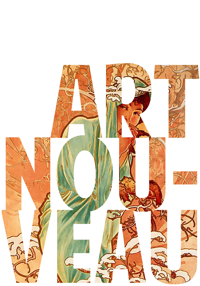
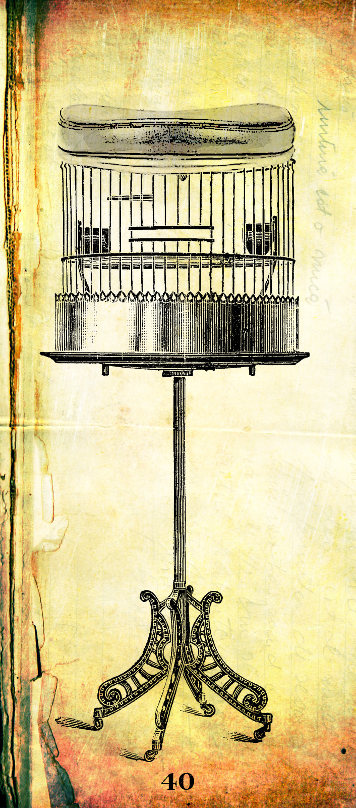
Art Nouveau was the reaction to the Arts and Crafts Movement. They believed in the machine and the possibilities behind the machine. They praised engineers as artists and embraced new technologies and materials as ways to enhance their artistic expression. They started to use machines in art and created an evolved style based on these ideas.

The Futurists came soon after these two groups, in the beginning of the 1900’s-right before the First World War. They suggested that society should reject all previous styles and ideas-to move onto the next era of thought. This takeover and renewal of thought would be constant-reoccurring every ten to twenty years (in the minds of the Futurists). They imagined a new society based on the machine-and architecture which reflected this.

The Deutsche Werkbund was a group of German artists, architects, and thinkers who were set on changing Germany as a world power and bringing the culture of art and creation to the foreground of German life. They saw little distinction between architecture, art, and print. This idea started to infiltrate into industry and product design.

Image sources: Morris Grafton, Alphonse Maria Mucha, Peter Behren and Antonio Sant’Elia.

This and That: Tron

Tron

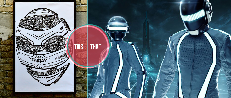
Art and pop culture walk hand in hand, yet many are not attuned to trends and styles that runs through both art and culture. This was amore obvious case as I instinctively thought of a space aged setting while viewing the ink on canvas print on the left. Surprisingly enough, this picture was hung in a tiki bar on one of the main beaches in Langkawi, Malaysia. The print reminded me of tron in particular because of the kind of helmet and light features that were present in the art piece.

The print reminded me of a movie that came out about two years ago-Tron. This remake of a 1982 science fiction film is all about speed space ship racing and light-up suits. The detailing in the print do take away from the very minimalistic tron suits and helmets, and lean towards a more the Starwars IV film. The compilation of these aspects remind us of certain things, but also give rise to so many other mediums and pieces of work like this forward chair design by Mike To (Seen on Made.com):
Chair by Mike To

Or this house design by Hanse Haus (Seen on Design Boom):
Chair by Mike To

What surprised-or rather interested me- was presence of this print. In fiction culture, we are so used to the fast paced changes. First it was Star Wars, then Back to the Future, then Harry Potter, then Eragon, then more Harry Potter, then Twilight, then Zombies, and it keeps going. These phases in fictional media are fast moving, but I think the art scene (however fast) moves a bit more slowly. Yet, when we recontemplate and rethink these pieces of art and media, we can gain new inspiration and again these similar themes and trends flow through the fiction scene.

(Images courtesy of Collider.com) Click the gif below for a full interview on Tron the movie.

Tron

On The Streets: Art and Design


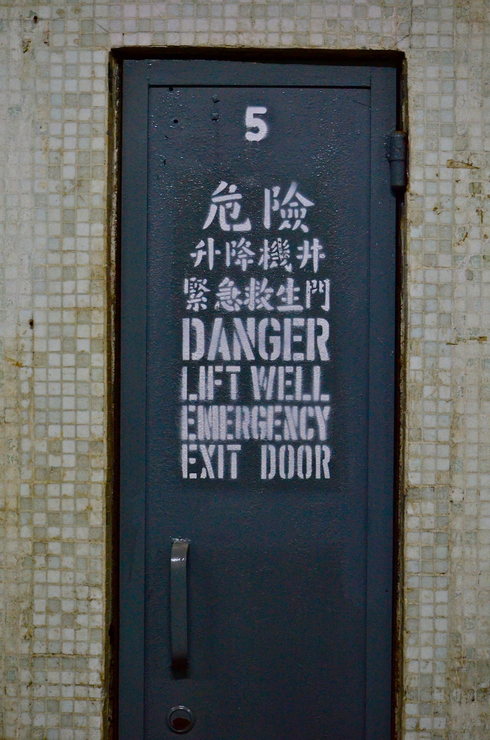
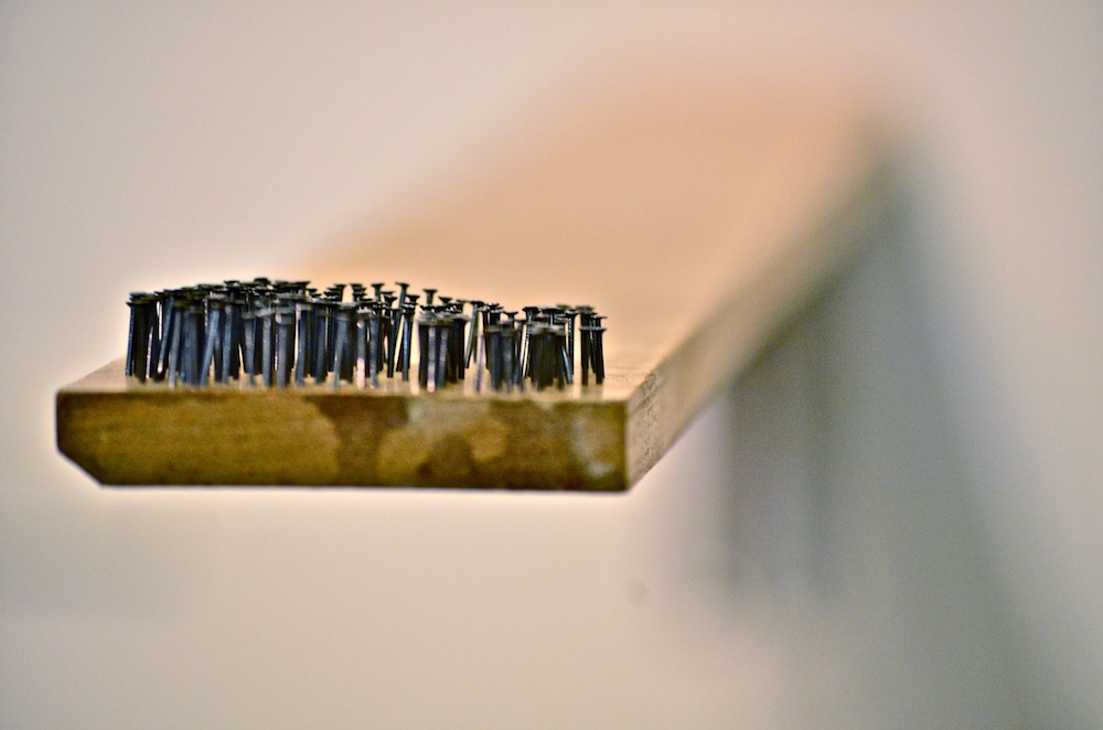
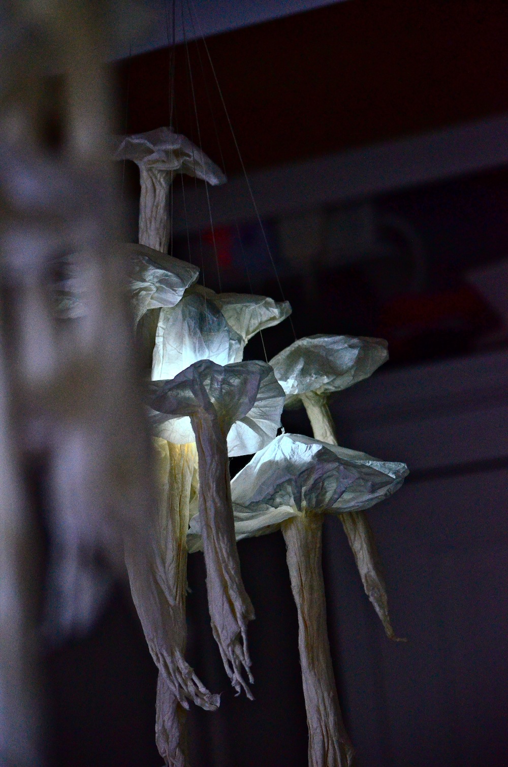
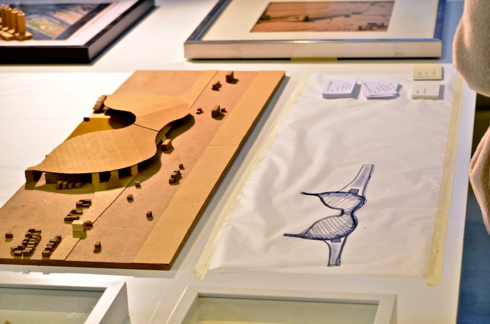
Only a day after getting back from vacation, I am getting back into the art, design, and architecture world. Hong Kong is known for it’s many design exhibitions and conferences, and last semester I visted the Detour exhibition, which was focussed on recycling and the use of so called “useless” items. Today I attended the Fotanian Open Studios Exhibition, a kind of progressive exhibition where artists, designers, and architects open their studios to the public. Located in Fotan, Hong Kong; many artists have started to take over industrial buildings for their galleries and studios. This reminded me of countless other industrial areas that have been converted to art districts, such as the 798 Art District in Beijing (http://www.798art.org/ | http://www.798space.com/). Past the industrial elevators and corridors, there were many studios that I really enjoyed. Here are some pictures of my favorites, a good mix of architecture, design, and art.